|
|
| Home | All Classes | Main Classes | Annotated | Grouped Classes | Functions | |
The QComboBox widget is a combined button and popup list. More...
#include <qcombobox.h>
Inherits QWidget.
A combobox is a selection widget which displays the current item and can pop up a list of items. A combobox may be editable in which case the user can enter arbitrary strings.
Comboboxes provide a means of showing the user's current choice out of a list of options in a way that takes up the minimum amount of screen space.
QComboBox supports three different display styles: Aqua/Motif 1.x, Motif 2.0 and Windows. In Motif 1.x, a combobox was called XmOptionMenu. In Motif 2.0, OSF introduced an improved combobox and named that XmComboBox. QComboBox provides both.
QComboBox provides two different constructors. The simplest constructor creates an "old-style" combobox in Motif (or Aqua) style:
QComboBox *c = new QComboBox( this, "read-only combobox" );
The other constructor creates a new-style combobox in Motif style, and can create both read-only and editable comboboxes:
        QComboBox *c1 = new QComboBox( FALSE, this, "read-only combobox" );
        QComboBox *c2 = new QComboBox( TRUE, this, "editable combobox" );
New-style comboboxes use a list box in both Motif and Windows styles, and both the content size and the on-screen size of the list box can be limited with sizeLimit() and setMaxCount() respectively. Old-style comboboxes use a popup in Aqua and Motif style, and that popup will happily grow larger than the desktop if you put enough data into it.
The two constructors create identical-looking comboboxes in Windows style.
Comboboxes can contain pixmaps as well as strings; the insertItem() and changeItem() functions are suitably overloaded. For editable comboboxes, the function clearEdit() is provided, to clear the displayed string without changing the combobox's contents.
A combobox emits two signals, activated() and highlighted(), when a new item has been activated (selected) or highlighted (made current). Both signals exist in two versions, one with a QString argument and one with an int argument. If the user highlights or activates a pixmap, only the int signals are emitted. Whenever the text of an editable combobox is changed the textChanged() signal is emitted.
When the user enters a new string in an editable combobox, the widget may or may not insert it, and it can insert it in several locations. The default policy is is AtBottom but you can change this using setInsertionPolicy().
It is possible to constrain the input to an editable combobox using QValidator; see setValidator(). By default, any input is accepted.
If the combobox is not editable then it has a default focusPolicy() of TabFocus, i.e. it will not grab focus if clicked. This differs from both Windows and Motif. If the combobox is editable then it has a default focusPolicy() of StrongFocus, i.e. it will grab focus if clicked.
A combobox can be populated using the insert functions, insertStringList() and insertItem() for example. Items can be changed with changeItem(). An item can be removed with removeItem() and all items can be removed with clear(). The text of the current item is returned by currentText(), and the text of a numbered item is returned with text(). The current item can be set with setCurrentItem() or setCurrentText(). The number of items in the combobox is returned by count(); the maximum number of items can be set with setMaxCount(). You can allow editing using setEditable(). For editable comboboxes you can set auto-completion using setAutoCompletion() and whether or not the user can add duplicates is set with setDuplicatesEnabled().
 (Motif 1, read-only)
 (Motif 2, editable)
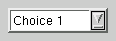
 (Motif 2, read-only)
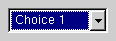 (Windows style)
Depending on the style, QComboBox will use a QListBox or a QPopupMenu to display the list of items. See setListBox() for more information.
See also QLineEdit, QListBox, QSpinBox, QRadioButton, QButtonGroup, GUI Design Handbook: Combo Box, GUI Design Handbook: Drop-Down List Box, and Basic Widgets.
This enum specifies what the QComboBox should do when a new string is entered by the user.
activated() is always emitted when the string is entered.
If inserting the new string would cause the combobox to breach its content size limit, the item at the other end of the list is deleted. The definition of "other end" is implementation-dependent.
This constructor creates a popup list if the program uses Motif (or Aqua) look and feel; this is compatible with Motif 1.x and Aqua.
Note: If you use this constructor to create your QComboBox, then the pixmap() function will always return 0. To workaround this, use the other constructor.
The input field can be edited if rw is TRUE, otherwise the user may only choose one of the items in the combobox.
The parent and name arguments are passed on to the QWidget constructor.
This signal is emitted when a new item has been activated (selected). The index is the position of the item in the combobox.
This signal is not emitted if the item is changed programmatically, e.g. using setCurrentItem().
Examples: fileiconview/mainwindow.cpp, helpviewer/helpwindow.cpp, lineedits/lineedits.cpp, listboxcombo/listboxcombo.cpp, and qmag/qmag.cpp.
This signal is emitted when a new item has been activated (selected). string is the selected string.
You can also use the activated(int) signal, but be aware that its argument is meaningful only for selected strings, not for user entered strings.
Returns TRUE if auto-completion is enabled; otherwise returns FALSE. See the "autoCompletion" property for details.
Returns TRUE if auto resize is enabled; otherwise returns FALSE. See the "autoResize" property for details.
Replaces the item at position index with the pixmap im, unless the combobox is editable.
See also insertItem().
Replaces the item at position index with the pixmap im and the text t.
See also insertItem().
This is particularly useful when using a combobox as a line edit with history. For example you can connect the combobox's activated() signal to clearEdit() in order to present the user with a new, empty line as soon as Enter is pressed.
See also setEditText().
Returns the number of items in the combobox. See the "count" property for details.
Returns the index of the current item in the combobox. See the "currentItem" property for details.
Returns the text of the combobox's current item. See the "currentText" property for details.
Returns TRUE if duplicates are allowed; otherwise returns FALSE. See the "duplicatesEnabled" property for details.
Returns TRUE if the combobox is editable; otherwise returns FALSE. See the "editable" property for details.
This signal is emitted when a new item has been set to be the current item. The index is the position of the item in the combobox.
This signal is not emitted if the item is changed programmatically, e.g. using setCurrentItem().
This signal is emitted when a new item has been set to be the current item. string is the item's text.
You can also use the highlighted(int) signal.
Examples: chart/optionsform.cpp, fileiconview/mainwindow.cpp, helpviewer/helpwindow.cpp, lineedits/lineedits.cpp, listboxcombo/listboxcombo.cpp, regexptester/regexptester.cpp, and tictac/tictac.cpp.
Inserts a pixmap item at position index. The item will be appended if index is negative.
Inserts a pixmap item with additional text text at position index. The item will be appended if index is negative.
The numStrings argument is the number of strings. If numStrings is -1 (default), the strings array must be terminated with 0.
Example:
        static const char* items[] = { "red", "green", "blue", 0 };
        combo->insertStrList( items );
See also insertStringList().
Example: qmag/qmag.cpp.
Inserts the list of strings at position index in the combobox.
This is only for compatibility since it does not support Unicode strings. See insertStringList().
Inserts the list of strings at position index in the combobox.
This is only for compatibility since it does not support Unicode strings. See insertStringList().
Returns the position of the items inserted by the user. See the "insertionPolicy" property for details.
Only editable listboxes have a line editor.
See also setListBox().
Example: listboxcombo/listboxcombo.cpp.
Returns the maximum number of items allowed in the combobox. See the "maxCount" property for details.
If the list is empty, no items appear.
Sets whether auto-completion is enabled. See the "autoCompletion" property for details.
Sets whether auto resize is enabled. See the "autoResize" property for details.
Sets the index of the current item in the combobox to index. See the "currentItem" property for details.
Sets the text of the combobox's current item. See the "currentText" property for details.
Sets whether duplicates are allowed to enable. See the "duplicatesEnabled" property for details.
This is useful e.g. for providing a good starting point for the user's editing and entering the change in the combobox only when the user presses Enter.
See also clearEdit() and insertItem().
Sets whether the combobox is editable. See the "editable" property for details.
Reimplemented from QWidget.
Sets the position of the items inserted by the user to policy. See the "insertionPolicy" property for details.
Warning: QComboBox assumes that newListBox->text(n) returns non-null for 0 <= n < newListbox->count(). This assumption is necessary because of the line edit in QComboBox.
Sets the maximum number of items allowed in the combobox. See the "maxCount" property for details.
Reimplemented from QWidget.
Sets the maximum on-screen size of the combobox. See the "sizeLimit" property for details.
This function does nothing if the combobox is not editable.
See also validator(), clearValidator(), and QValidator.
Returns the maximum on-screen size of the combobox. See the "sizeLimit" property for details.
See also currentText.
Examples: fileiconview/mainwindow.cpp and helpviewer/helpwindow.cpp.
This signal is used for editable comboboxes. It is emitted whenever the contents of the text entry field changes. string contains the new text.
See also setValidator(), clearValidator(), and QValidator.
This property holds whether auto-completion is enabled.
This property can only be set for editable comboboxes, for non-editable comboboxes it has no effect. It is FALSE by default.
Set this property's value with setAutoCompletion() and get this property's value with autoCompletion().
This property holds whether the combobox is automatically masked.
See also QWidget::autoMask.
This property holds whether auto resize is enabled.
This property is obsolete. It is provided to keep old source working. We strongly advise against using it in new code.
If this property is set to TRUE then the combobox will resize itself whenever its contents change. The default is FALSE.
Set this property's value with setAutoResize() and get this property's value with autoResize().
This property holds the number of items in the combobox.
Get this property's value with count().
This property holds the index of the current item in the combobox.
Note that the activated() and highlighted() signals are only emitted when the user changes the current item, not when it is changed programmatically.
Set this property's value with setCurrentItem() and get this property's value with currentItem().
This property holds the text of the combobox's current item.
Set this property's value with setCurrentText() and get this property's value with currentText().
This property holds whether duplicates are allowed.
If the combobox is editable and the user enters some text in the combobox's lineedit and presses Enter (and the insertionPolicy() is not NoInsertion), then what happens is this:
This property only affects user-interaction. You can use insertItem() to insert duplicates if you wish regardless of this setting.
Set this property's value with setDuplicatesEnabled() and get this property's value with duplicatesEnabled().
This property holds whether the combobox is editable.
This property's default is FALSE. Note that the combobox will be cleared if this property is set to TRUE for a 1.x Motif style combobox. To avoid this, use setEditable() before inserting any items. Also note that the 1.x version of Motif didn't have any editable comboboxes, so the combobox will change it's appearance to a 2.0 style Motif combobox is it is set to be editable.
Set this property's value with setEditable() and get this property's value with editable().
This property holds the position of the items inserted by the user.
The default insertion policy is AtBottom. See Policy.
Set this property's value with setInsertionPolicy() and get this property's value with insertionPolicy().
This property holds the maximum number of items allowed in the combobox.
Set this property's value with setMaxCount() and get this property's value with maxCount().
This property holds the maximum on-screen size of the combobox.
This property is ignored for both Motif 1.x style and non-editable comboboxes in Mac style. The default limit is ten lines. If the number of items in the combobox is or grows larger than lines, a scrollbar is added.
Set this property's value with setSizeLimit() and get this property's value with sizeLimit().
This file is part of the Qt toolkit. Copyright © 1995-2007 Trolltech. All Rights Reserved.
| Copyright © 2007 Trolltech | Trademarks | Qt 3.3.8
|